monday.com helps businesses create custom workflows with Chromatic
Challenge
As the number of monday.com employees and customers exploded, they needed to ship UIs fast without breaking things. Orr Gottlieb, monday.com’s engineering manager, shares how monday.com adopted Chromatic and Storybook to catch UI bugs earlier and keep teams aligned. All without needing to staff a QA team.
- Guarantee UI quality without manual work
- Increase efficiency of a large team spread across multiple time zones
- Improve communication in interdisciplinary teams


Guarantee UI quality without manual work
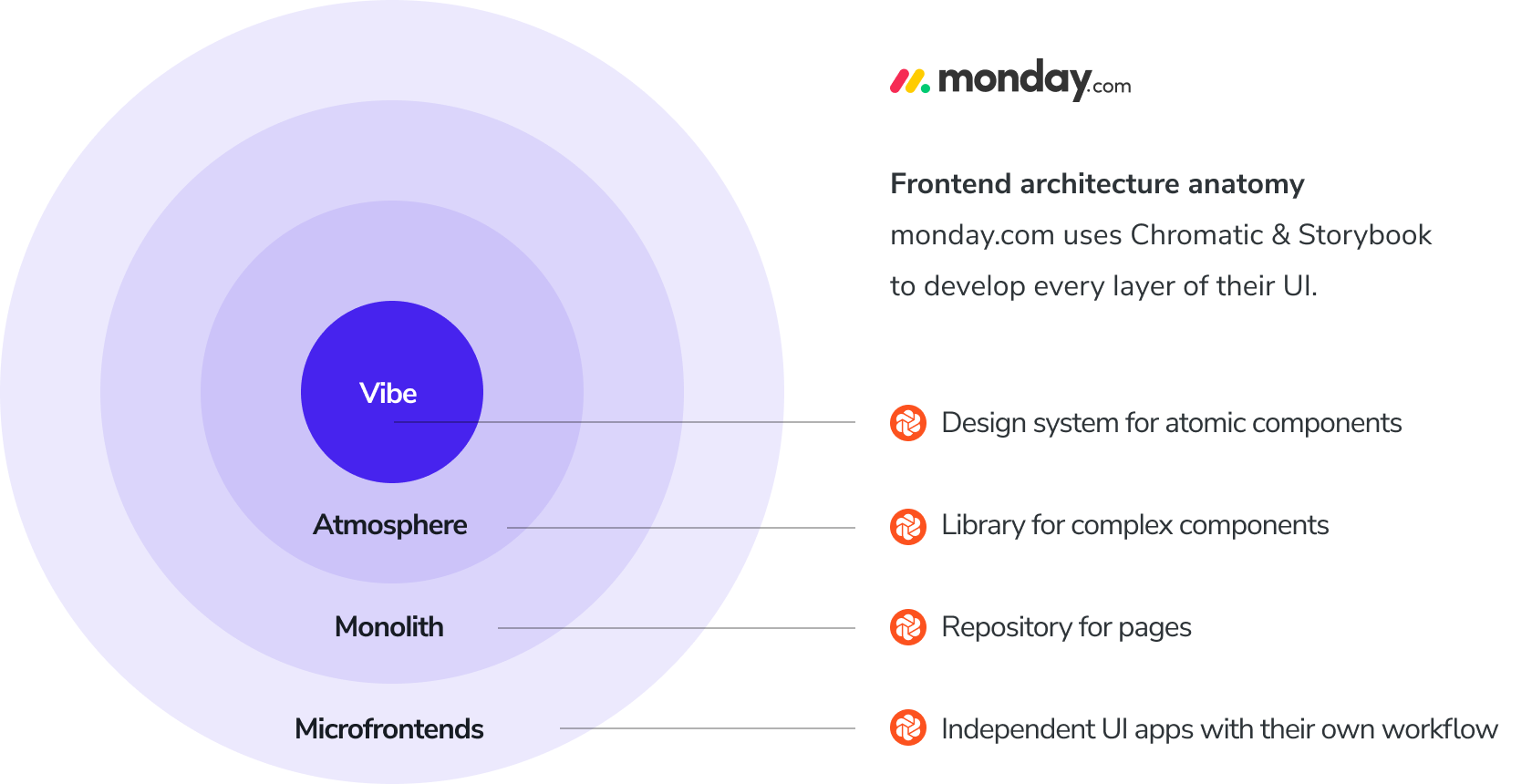
Founded in 2014, monday.com’s codebase spans generations of technology ranging from modern React and Typescript to legacy Backbone and CoffeeScript. Their monorepo often has 400 open pull requests, all of which can change any part of the product.
With an ever-evolving service, it’s easy to introduce regressions and tough to debug them. This can degrade the user experience for 150,000+ customers while also wasting developer time fixing bugs.
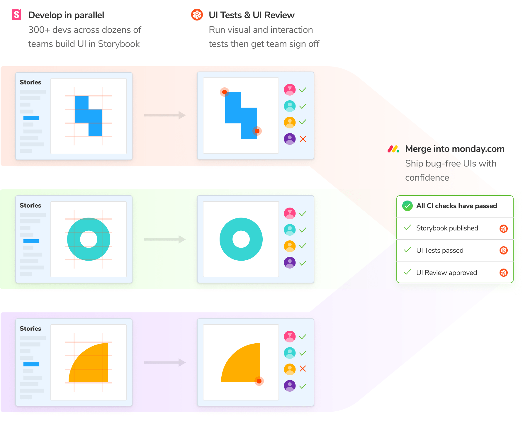
monday.com prevents regressions with Chromatic’s automated UI Tests. They run interaction and visual regression tests on every pull request. This allows developers to pinpoint bugs early, during development, instead of having to fix them later in production. They even authored their own Storybook addon for performance testing. monday.com can then ensure, as Orr put it, “nothing changes other than what we really, really want to change.”
Since there are no dedicated QA engineers at monday.com, Chromatic is crucial for allowing each developer to take full ownership of their work quality without manual work. With UI Tests, Chromatic automatically detects changes then notifies developers to verify that they’re intentional improvements.

Increase efficiency and output
Larger teams aren’t always faster. In practice, more stakeholders means more deliberation which stretches the time between coming up with an idea and shipping it. The sheer size of an organization can end up holding back contributors from doing their most valuable work.
monday.com has 300+ engineers spread across dozens of teams around the world. Each team owns a different area of the platform and ships in parallel with the other teams. At this size, it’s tricky to coordinate across the breadth of the organization.
Their goal is to give developers agency to build fast while also maintaining a unified user experience. That’s why they adopted Storybook to develop all of their UIs in isolation. Storybook enables teams to work on discrete UI areas without stepping on each others’ work.
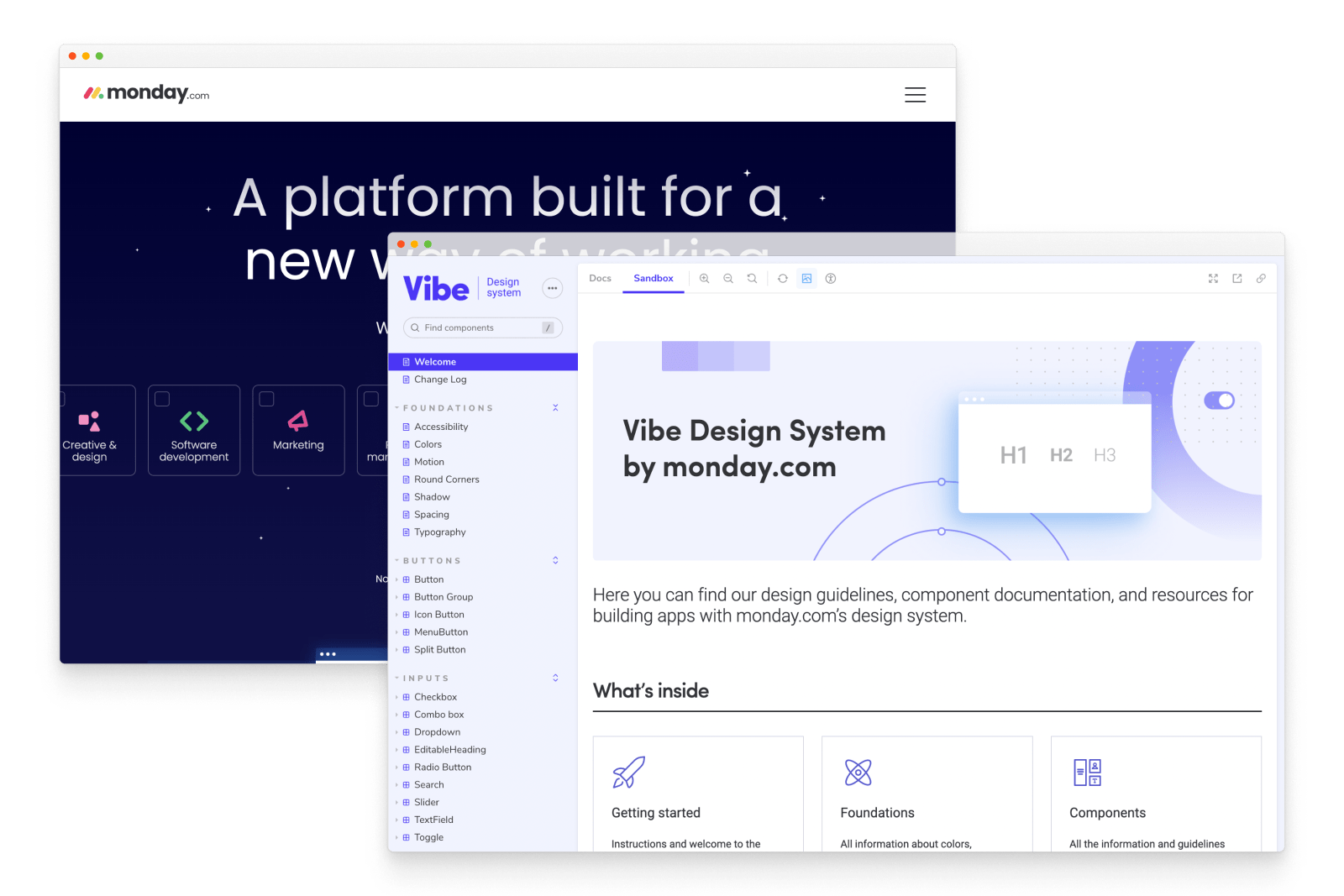
What’s more, Storybook allows frontend developers to work on UI without needing to spin up the whole application stack. This frees up developer time that would otherwise be wasted waiting. monday.com’s design system is also built with Storybook. Vibe is a shared component library reused across every team. These ready-made components speed up frontend development while also ensuring customers get a unified user experience.

Improve communication in interdisciplinary teams
Communication in interdisciplinary teams is messy. Developers, designers, and product owners all work toward a collective goal but often have different points of view and separate tools.
Sign-offs can be chaotic because reviewers might reference outdated designs, leading to confusion about what’s actually getting built. Meanwhile, change requests can come through many channels—chat, tickets, emails, etc.
monday.com used Chromatic’s UI Review to keep feedback and sign-off moving. It helped developers, designers, and product managers stay aligned on the latest implementation changes.
UI Review compiles every UI change in a feature branch and compares it to what’s currently in production. Each new push refreshes that changeset, so stakeholders always have an up-to-date list of what to review.
monday.com also publishes dozens of Storybooks to Chromatic so that teams can reference each other’s work without touching code. For example, the Storybook for Vibe design system provides comprehensive UI documentation for core UI patterns, including do’s and don’ts, principles, and API reference. Organizational transparency gives teams a shared understanding of monday.com’s UI.

Giving everyone the power to build
As monday.com grows, Storybook and Chromatic are central tools in their frontend infrastructure. Developers rely on Storybook to isolate and decouple their work, while Chromatic preserves visual fidelity and simplifies collaboration. These benefits help teams ship better code, more quickly, together.
If this sounds like an outcome your team could also benefit from, try Chromatic for free or contact our sales team to learn more.